Widget Design
The Widget Design feature allows you to create, manage, and customize the visual appearance and basic presentation of your chatbot widget. This includes branding, greeting content, email transcript appearance, and visibility options.
This feature focuses only on how the chatbot looks and communicates with users, not on chatbot logic or workflows.
Accessing Widget Design
Navigate to:
Sidebar → Widget Management → Widget Design
You will land on the Create a Widget Design screen.
Create a New Widget Design
Click the Create button to create a new widget design for your chatbot.
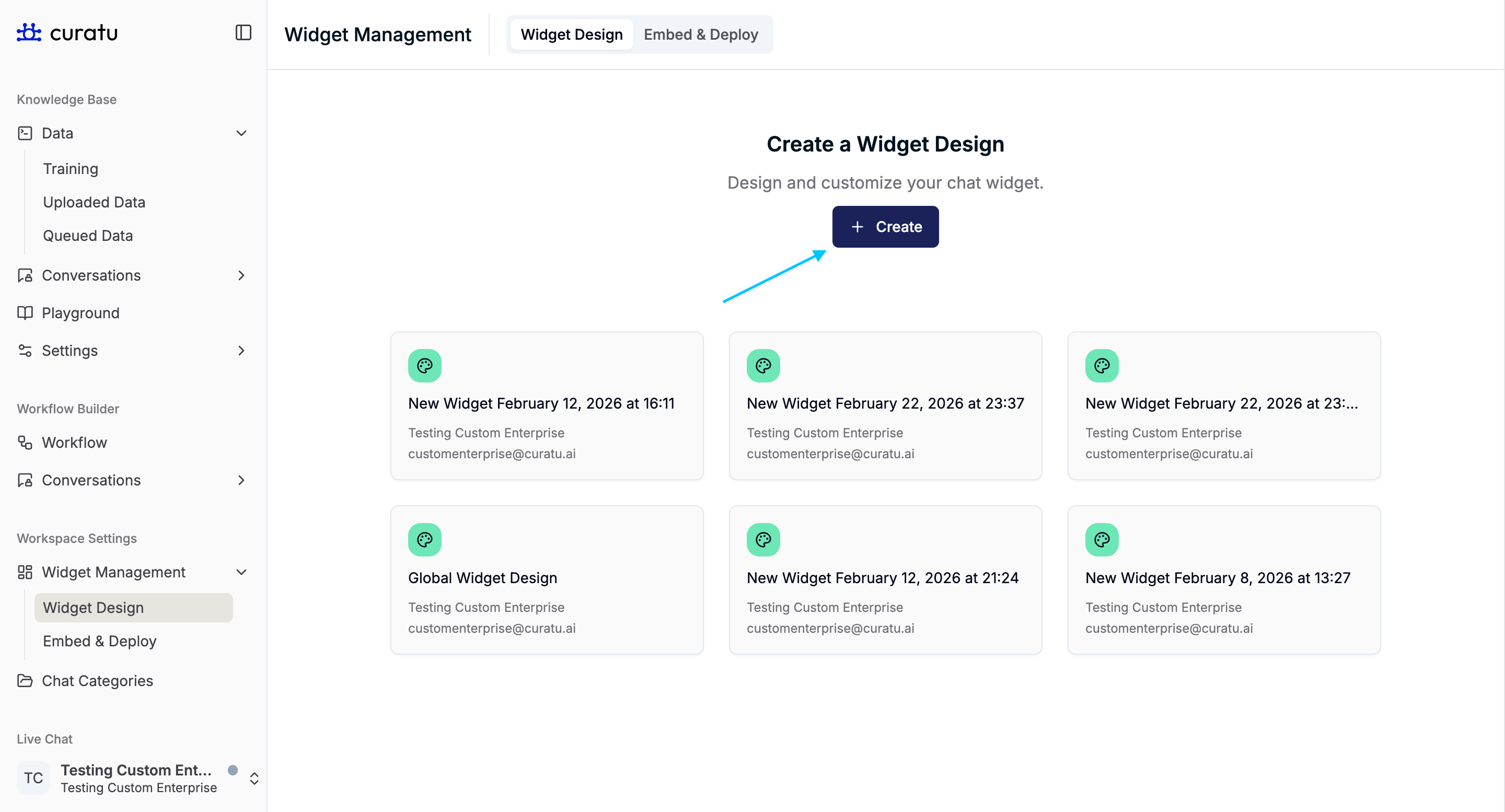
After creation:
- You will redirected on newly created widget design.
- The new widget design appears in the list
- Each widget design is displayed as a card
Widget Design List View
The list view shows:
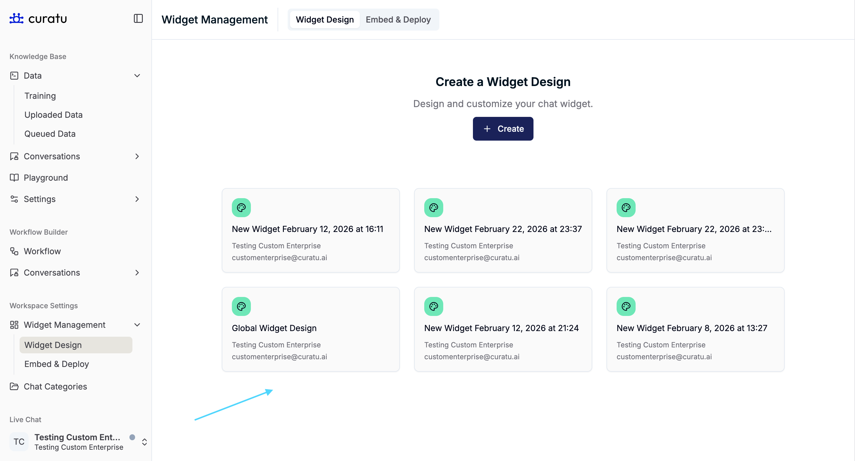
- All created widget designs
- Each design as a selectable card
This allows you to:
- Manage multiple widget designs
- Reopen and update older designs when required
Widget Design Editor Layout
When a widget design is opened, the screen is divided into two sections:
- Left panel: Widget design settings
- Right panel: Live chatbot preview
Any change made on the left is immediately reflected in the preview on the right.
Renaming a Widget Design
At the top of the editor, the widget design name is displayed.
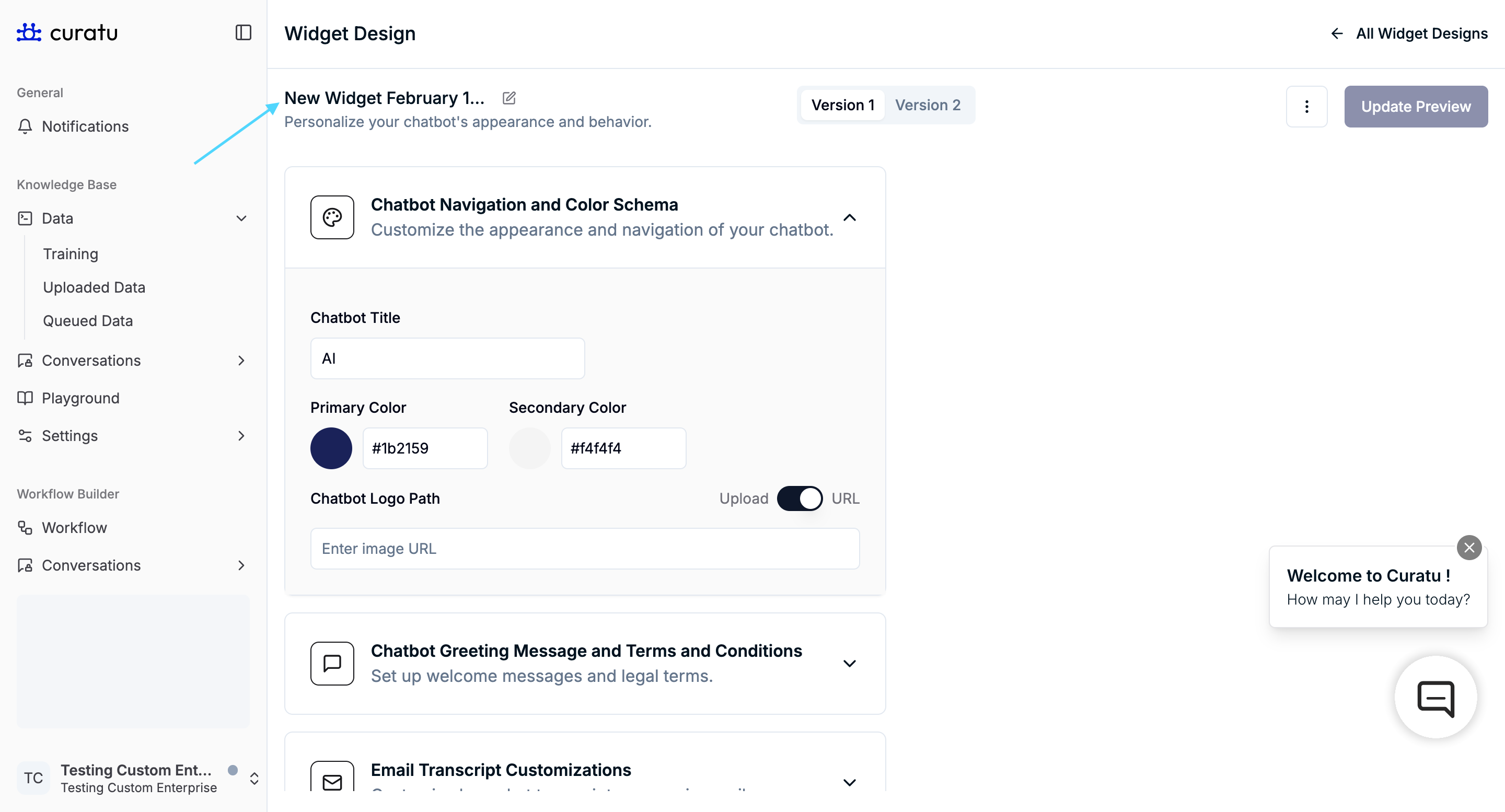
- Click the pencil icon
- Update the widget design name
This helps distinguish between multiple designs.
Widget Design Versions
Each widget design contains two versions:
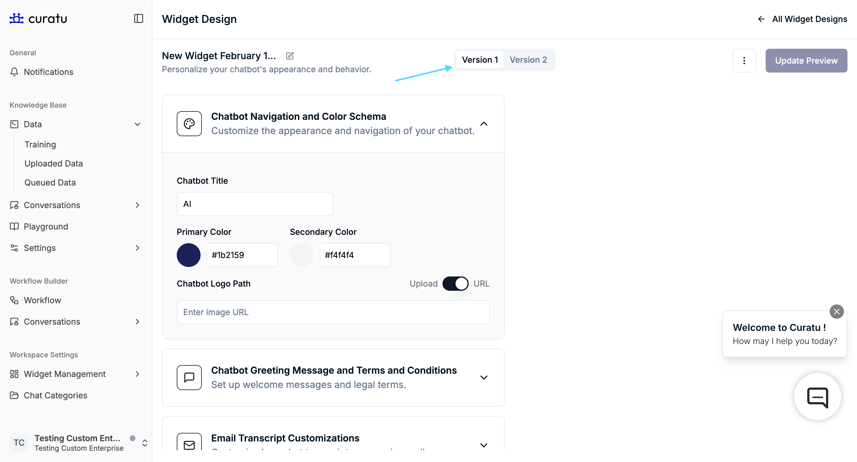
- Version 1 (default)
- Version 2 (upgraded)
Important behavior
- You start in Version 1 by default
- Version 1 and Version 2 are completely independent
- Branding or settings applied in one version do not apply to the other
- Each version must be configured separately
This allows parallel management of older and upgraded chatbot designs.
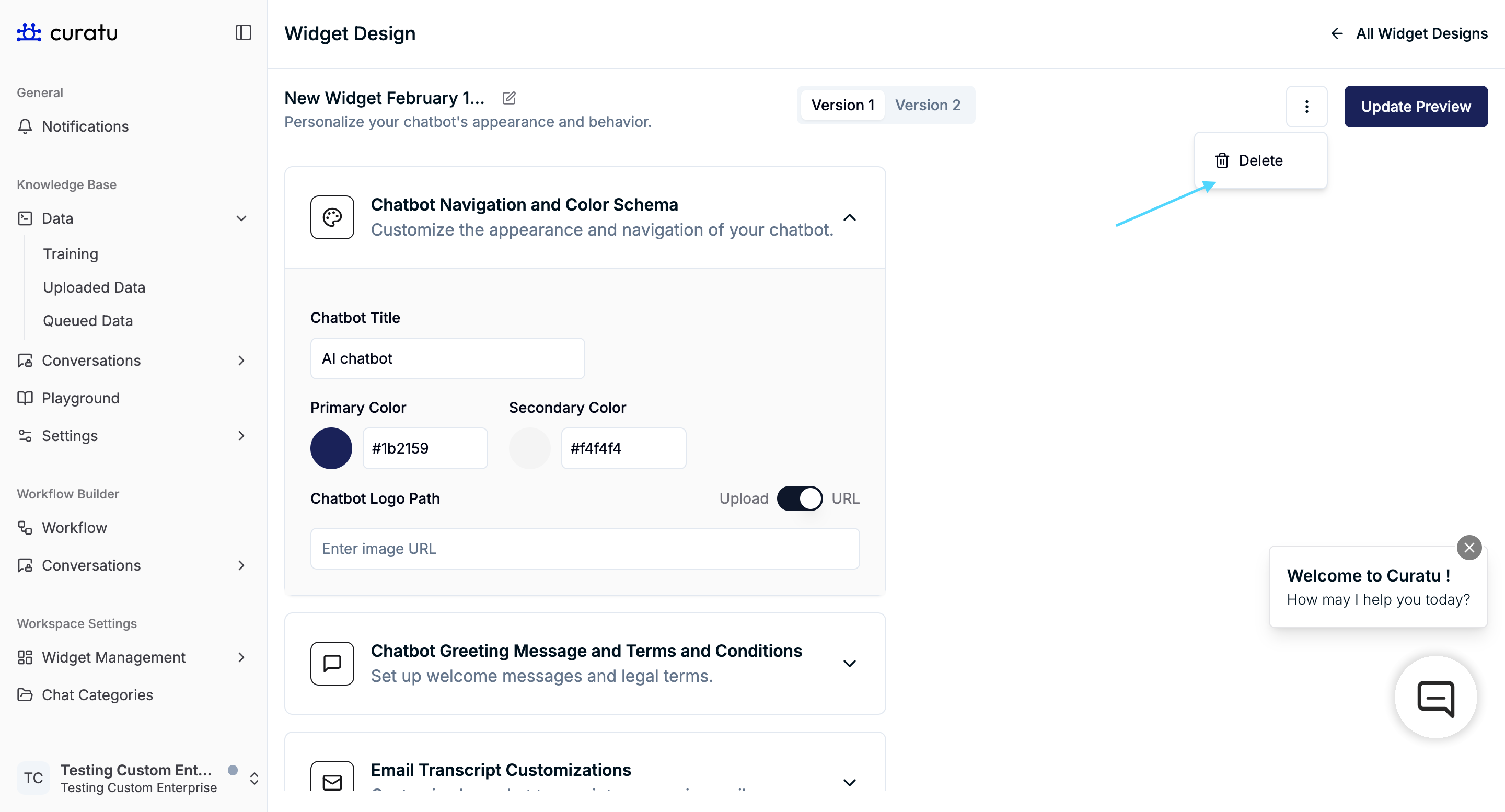
Deleting a Widget Design
Click the three-dot menu in the top-right corner of the widget design editor.
Case 1: Widget Design is in Use

- A confirmation modal appears
- The modal shows where the widget design is currently used
- Deleting it will remove all connected dependent resources
- Write workflow name below input field and click on delete button
Case 2: Widget Design is Not in Use
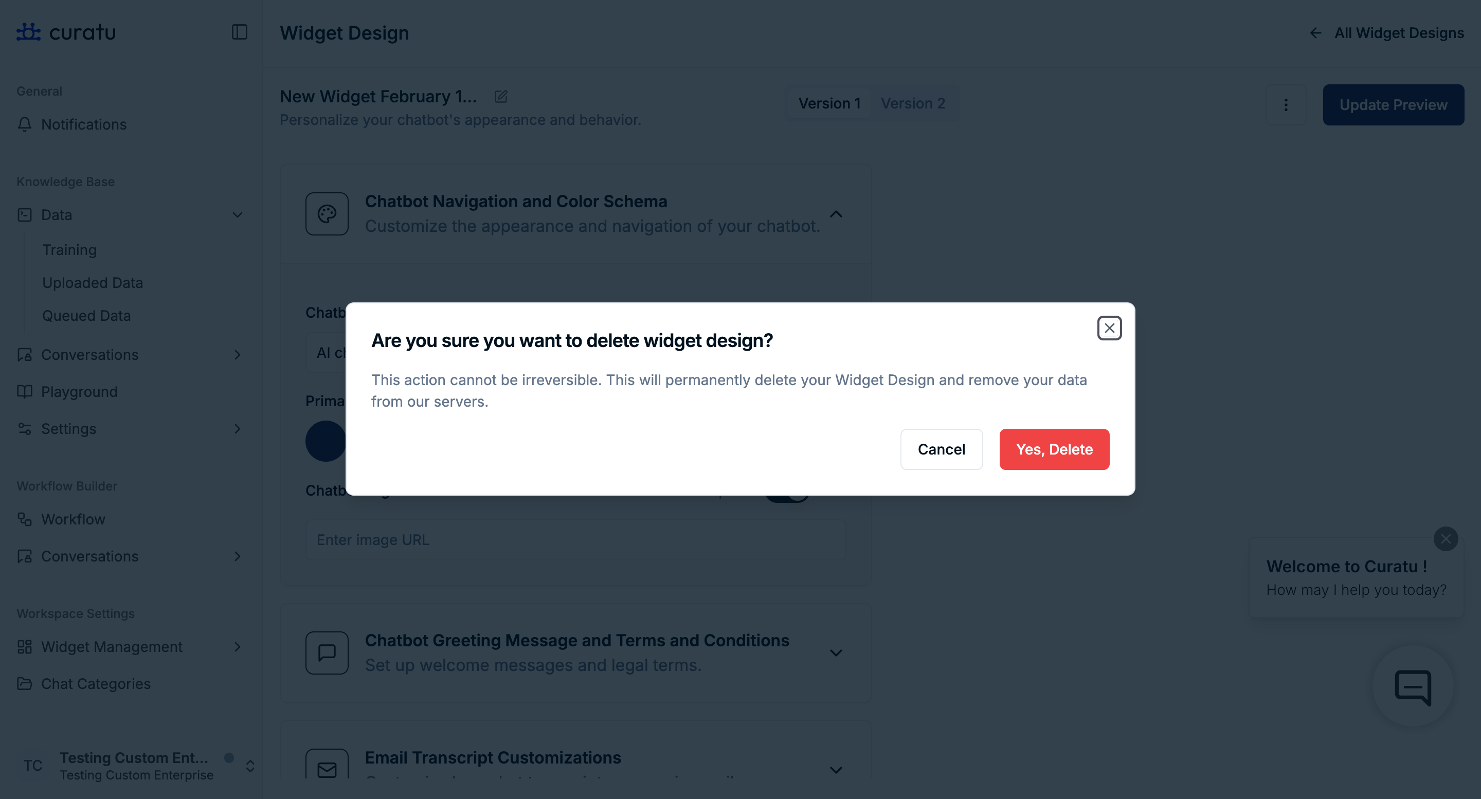
- A simple delete option is shown
- No dependency information is displayed
- The widget design is deleted after confirmation
(Simple delete dropdown – placeholder)
Live Preview and Update Behavior
- Changes made in the design settings are shown instantly in the preview chatbot
- The preview is only visual until confirmed
Update Preview
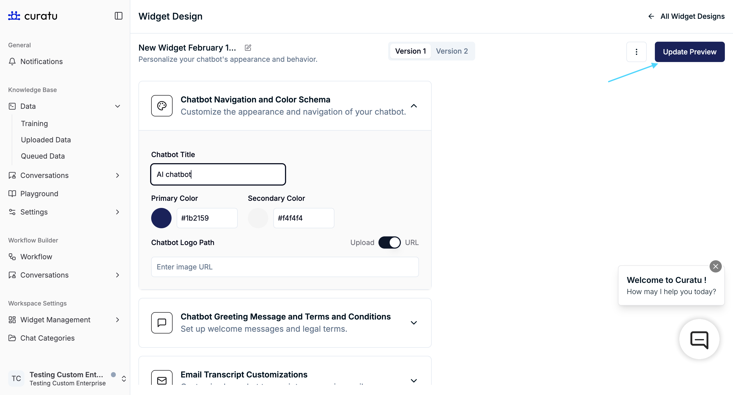
Click Update Preview to apply the changes to the deployed chatbot.
Until this button is clicked, changes are not reflected in the live chatbot.