UI Configuration & Brand Styling (Version 2)
This section manages the enhanced visual experience and branding configuration of the chatbot in Version 2.

You can configure:
- Chatbot title and header layout
- Primary and accent theme colors
- Brand logo and display style
- Navigation style and interface appearance
These settings define the overall look, feel, and branded presentation of the chatbot, ensuring a more modern and customizable user experience compared to Version 1.
Appearance and Branding
This section controls the core identity elements of the chatbot.
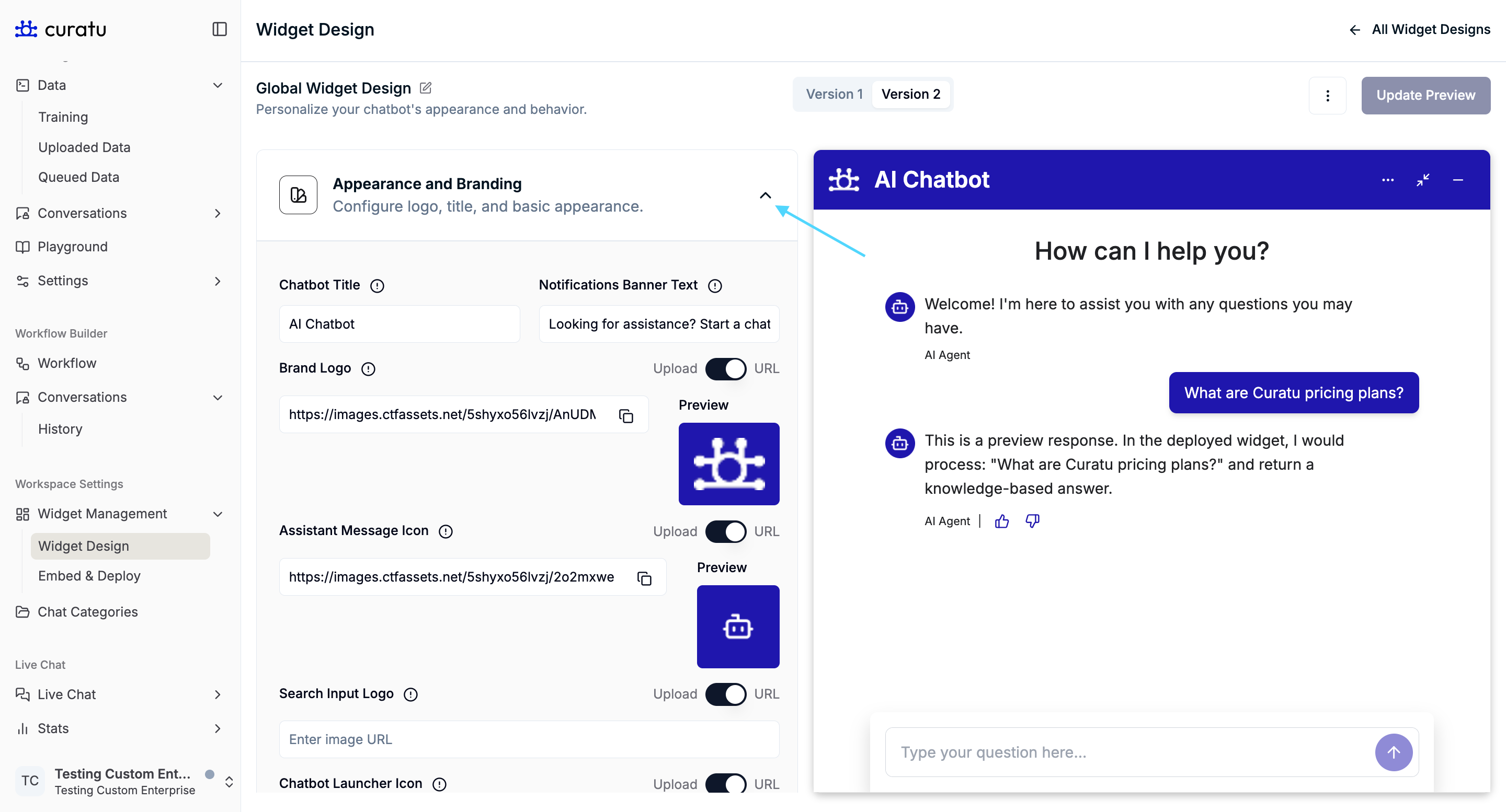
Chatbot Title
The Chatbot Title appears in the header of the chatbot window when the chatbot is opened.
It helps users identify the chatbot and is always visible at the top of the chat interface.
Notifications Banner Text
The Notifications Banner Text is displayed as a banner-style message in the chatbot interface.
- It is used to attract user attention
- Commonly appears as a short call-to-action message
- Example usage: encouraging users to start a chat
(Referenced in notification banner screenshots)
Brand Logo
The Brand Logo is shown in the top-left area of the chatbot header, positioned next to the chatbot title.
This helps visually associate the chatbot with your brand.
Assistant Message Icon
The Assistant Message Icon appears to the left of bot messages inside the chat conversation.
It visually represents the chatbot when it sends messages to the user.
Search Input Logo
The Search Input Logo is displayed inside the chat input field trigger when using a trigger style that includes:
- An input field
- Suggestion buttons
This icon appears inside the input area, next to the placeholder text.
(Referenced in input-field trigger screenshots)
Chatbot Launcher Icon
The Chatbot Launcher Icon is the round floating icon used to open the chatbot.
- Visible when the chatbot is closed
- Acts as the primary entry point for users to start a conversation
Color Scheme
The Color Scheme section controls all visual colors used across the chatbot interface.
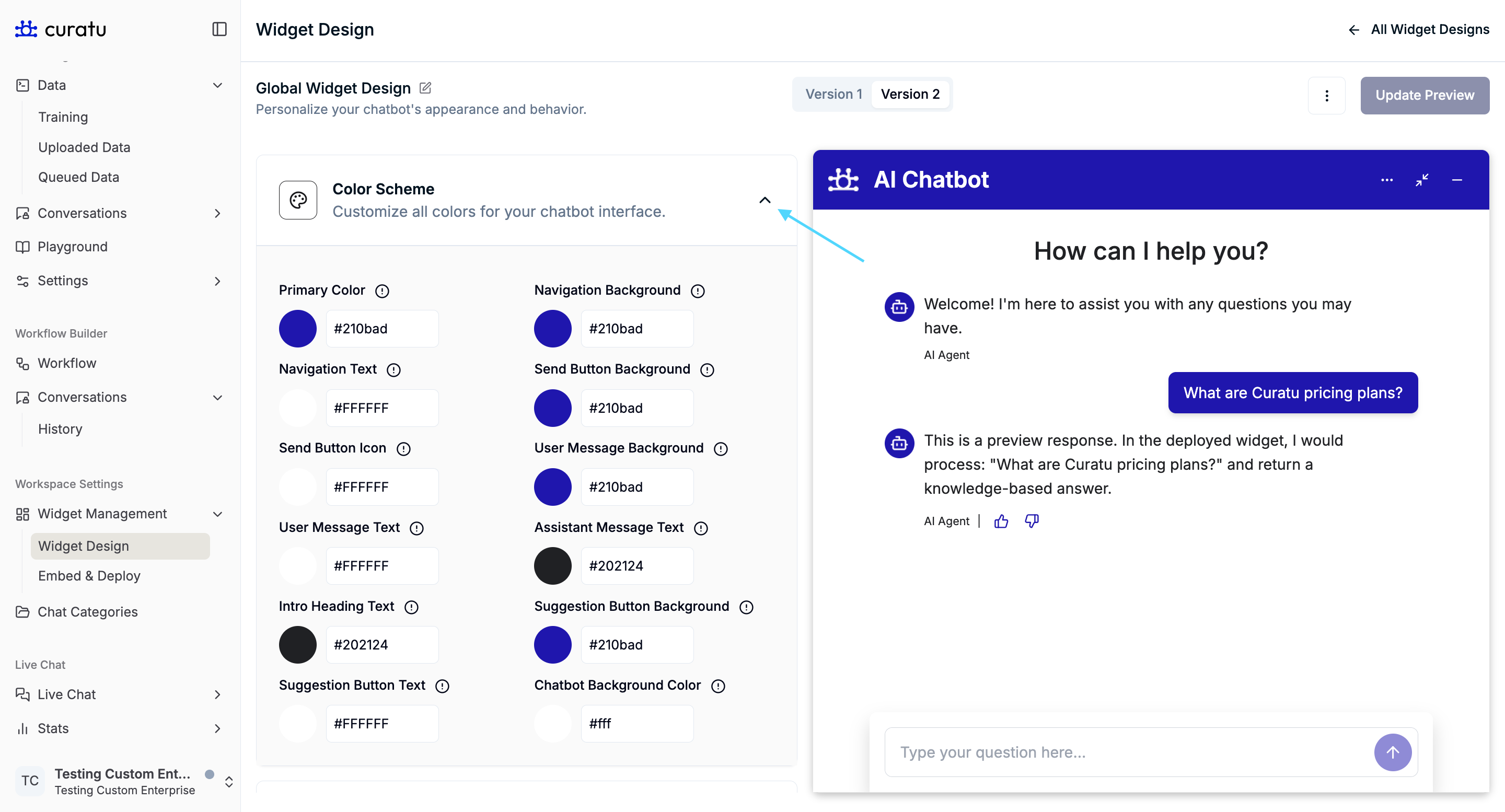
Colors are applied to different parts of the chatbot such as:
- Header and navigation areas
- Buttons and suggestion chips
- User and assistant messages
- Backgrounds and text elements
These settings allow you to align the chatbot visually with your brand without changing its behavior.
Text and Messages
This section controls all user-facing text content inside the chatbot.
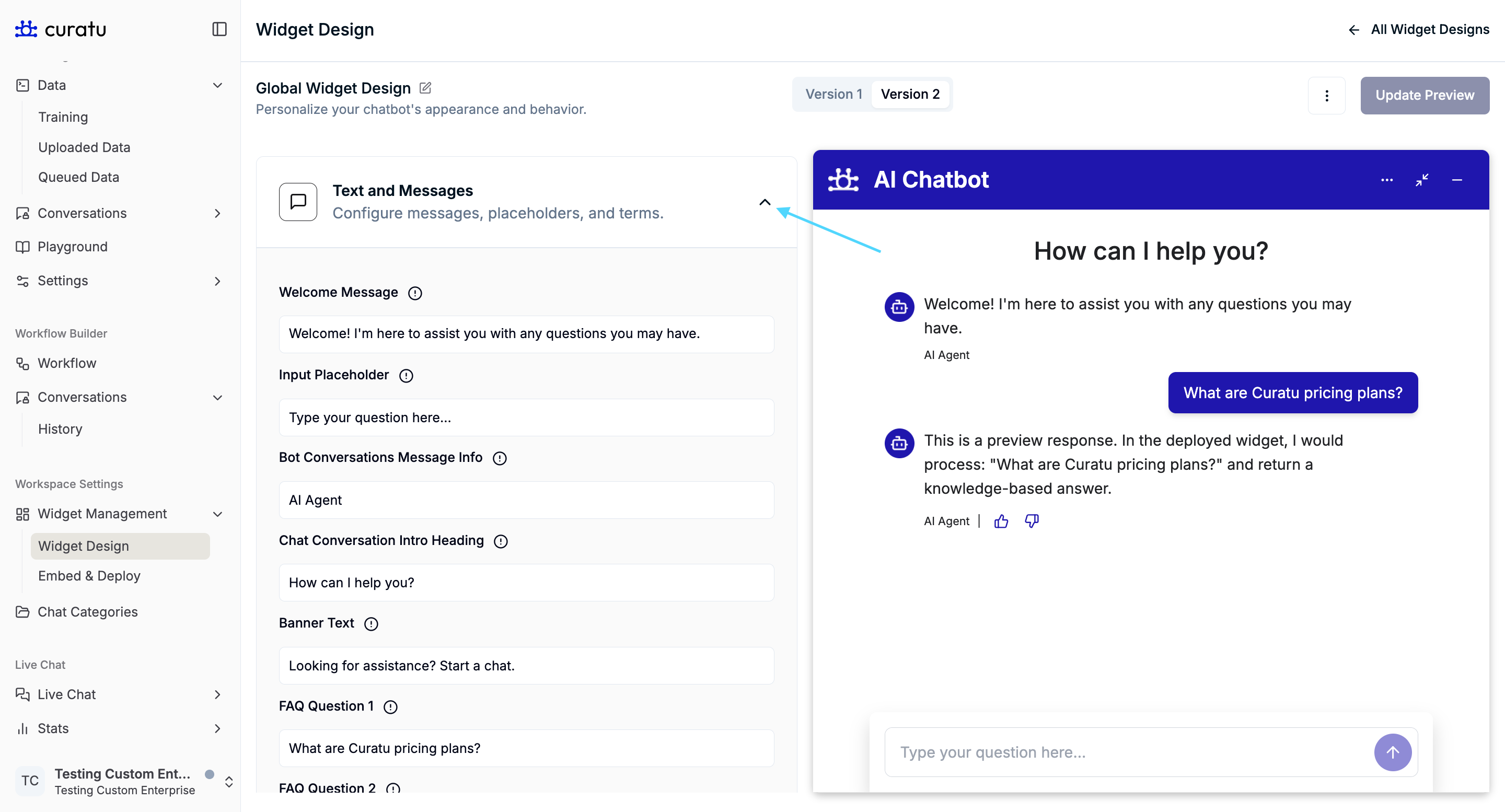
Input Placeholder
The Input Placeholder is the placeholder text shown inside the chat input field before the user types a message.
This is especially visible when using the input-field trigger design.
(Referenced in search input logo screenshots)
Bot Conversations Message Info
The Bot Conversations Message Info text appears below bot messages.
It is used to show additional contextual information related to bot responses.
Chat Conversation Intro Heading
The Chat Conversation Intro Heading appears at the top of the conversation area, above the welcome message.
It is typically styled as a prominent heading and introduces the conversation context.
Banner Text
The Banner Text is shown on a minimized or compact chatbot trigger after:
- A chat has already started, or
- At least one message has been exchanged
When the chatbot is minimized from a maximized view, this banner-style trigger becomes visible.
(Referenced in minimized trigger screenshots)
FAQ Questions
You can configure up to three FAQ questions:
- FAQ Question 1
- FAQ Question 2
- FAQ Question 3
These FAQs appear:
- Below the welcome message (When the chatbot is opened for the first time in minimized view)
- Below the textarea in rectangular chatbot trigger button.
Once a user selects any FAQ option:
- The FAQ buttons are hidden
- The chatbot transitions into normal conversation mode
(Referenced in minimized chatbot screenshots with suggestion buttons)
Terms and Conditions
The Terms and Conditions screen is shown as the first screen when the chatbot is opened.
Users see this content before starting the conversation, helping communicate important usage or legal information.
Email Transcript Customizations
This section controls how chat transcripts appear when shared via email.
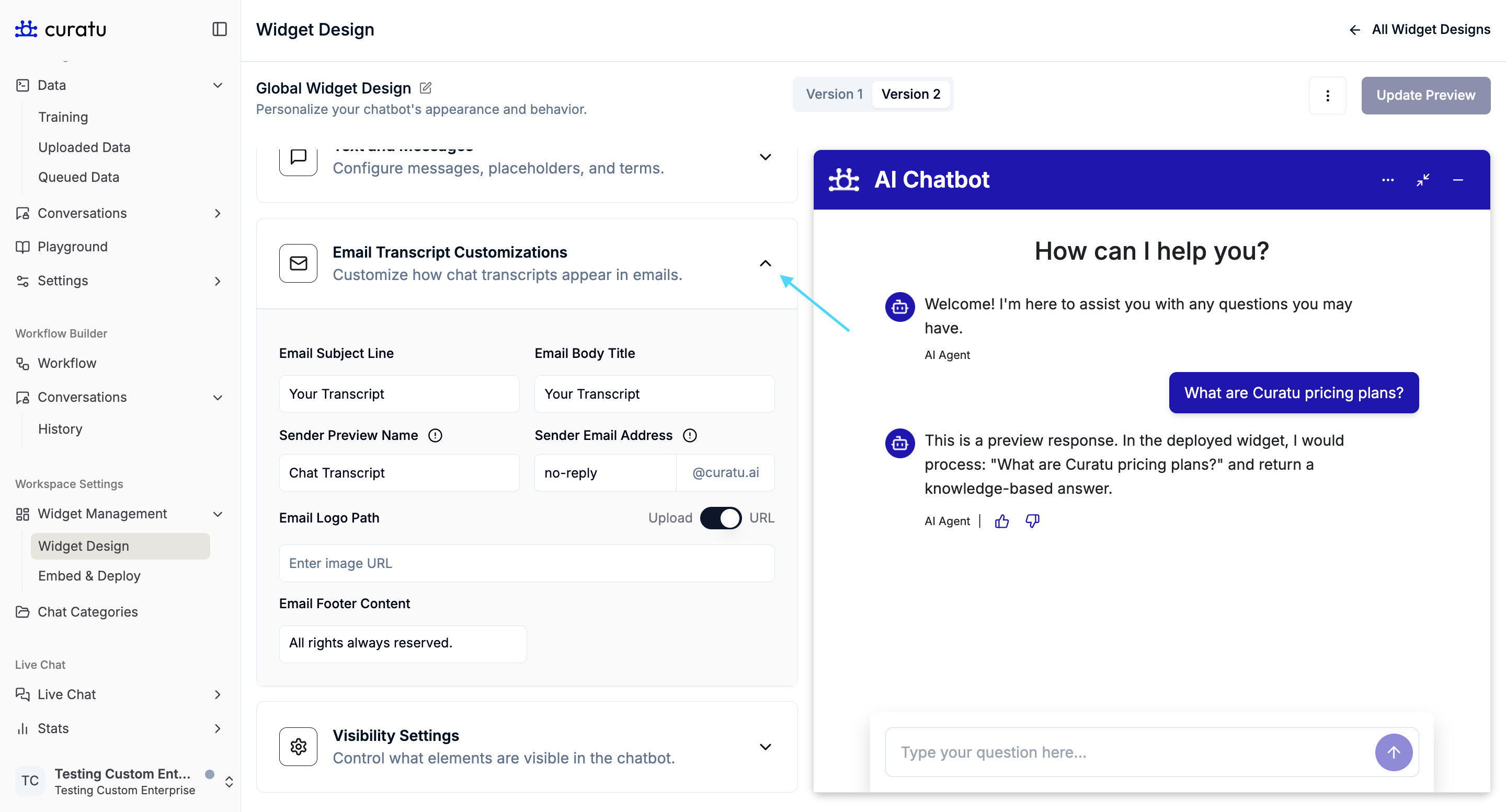
You can customize:
- Email subject line
- Email body title
- Sender preview name
- Sender email address
- Email logo
- Email footer content
These settings affect presentation only and do not control email delivery logic.
Visibility Settings
The Visibility Settings section controls which interface elements are visible to users.
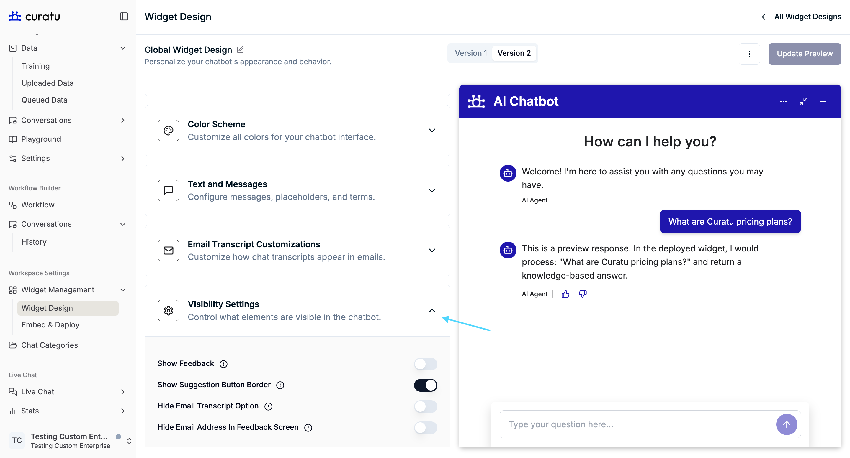
Show Feedback
Controls whether the feedback screen is available to users after a conversation.
When enabled, users can submit feedback about their experience.
Show Suggestion Button Border
Controls whether suggestion buttons (such as FAQs) display a visible border.
This affects only the visual styling of suggestion buttons.
Hide Email Transcript Option
Controls whether the Email Transcript option is visible in the chatbot menu.
When enabled:
- The option to request or view email transcripts is hidden from users
(Referenced in menu screenshots showing the email transcript option)
Hide Email Address in Feedback Screen
Controls whether the email address input field is visible on the feedback screen.
When enabled:
- Users can submit feedback without entering an email address
(Referenced in feedback screen screenshots)
Summary
The Widget Design feature allows you to:
- Define chatbot identity through titles, icons, and branding
- Customize all user-facing text and prompts
- Control visual appearance using a centralized color scheme
- Guide first-time user interactions with FAQs and banners
- Manage feedback and transcript visibility without affecting chatbot logic
All settings described here apply only to presentation and visibility, ensuring a clear separation between design and chatbot behavior.